What the data actually says — reading the Ford Escape FFT
Series 1, Post 2B · REPLICATE — Data cleaning, FFT processing, and order identification

What you have and what you need
In Post 2A you walked away with a folder of CSV files and a set of notes describing exactly when and how each one was recorded. That raw data doesn’t mean much on its own. Three columns of numbers per file, hundreds of rows, no obvious pattern to the eye.
This post turns that raw data into something readable. The journey is the same every time: clean the signal, run the FFT, find the peaks, and figure out what each one actually represents.
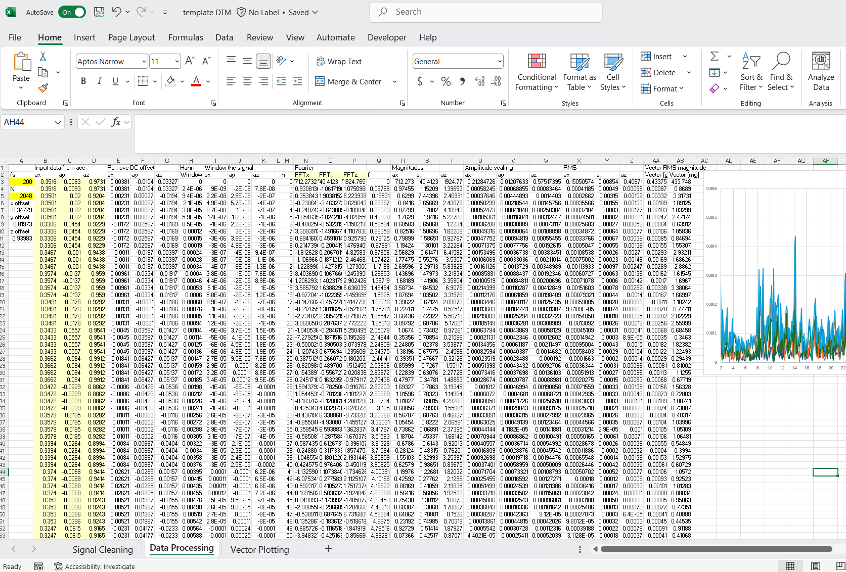
I process this in an Excel template I built specifically for this workflow. It handles some of the math automatically, removing the DC component, applying a Hanning window to the signal, getting the RMS values, but the core steps, selecting your data window and running the actual FFT, are still manual. Understanding the math behind each step is not the point of this post rather than knowing how to analyze the already-transformed data. A future post will be focused in deeper explaining the math involved in transforming the time-domain signal to a frequency-domain signal.
If you’d like a copy of the template to follow along on your own data, leave a comment and I’ll send it your way.
Inspecting and selecting the time signal
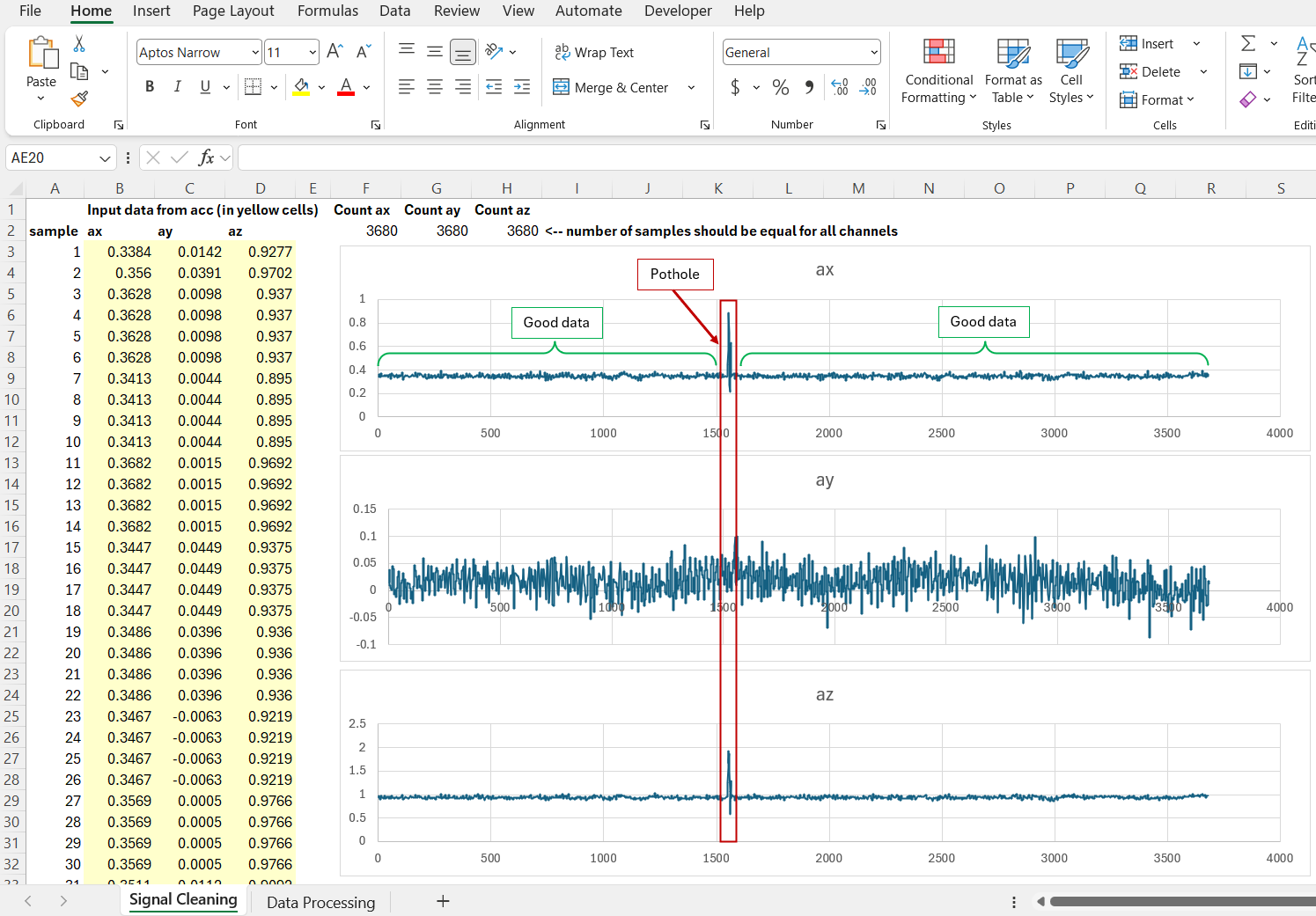
Open the CSV, copy the X, Y, Z acceleration columns into the template, and look at the raw time signal of each channel before doing anything else.
What you’re looking for is simple. Does the signal look like steady, repeating vibration, or does something jump out as abnormal? In several of the Escape runs, I saw brief spikes in acceleration that didn’t fit the surrounding pattern, almost certainly a bridge expansion joint or a pothole the car rolled over mid-recording. Real highways aren’t laboratories, and these moments are expected.
The fix isn’t complicated: find a window of time free of those disturbances and use that. But the window has to be a specific length. Not any number of points, but a power of 2. I typically use 1024 or 2048 points. This isn’t arbitrary; the FFT algorithm built in the Excel toolbox is constraint to operate this way.
Once you’ve identified a clean stretch of signal of the right length, free of any obvious anomaly, you’re ready for the next step.
What the template handles automatically
Before running the FFT, the signal needs two quick treatments. The template does both automatically: removing the DC component (the sensor’s baseline offset, subtracted so the signal is centered around zero) and applying a Hanning window (tapering the edges of the selected window to zero, which prevents the FFT from introducing frequency content that isn’t really there). Deeper explanation will be given on that future post eventually. For now, just know they happen and why they’re necessary.
After the FFT itself runs (covered in the next section) there are a few more automatic steps before you get a single readable plot. For each channel individually (X, Y, and Z), the template converts the raw FFT output into a magnitude using the IMABS() function, scales that result based on how many samples were used in the window (1024 or 2048, whichever length was selected, so runs of different lengths stay comparable), and then calculates the RMS of that scaled magnitude. Once all three channels have gone through that process independently, the template combines the three RMS values into a single vector magnitude. That combined signal is what actually gets plotted.
None of these steps require you to do anything by hand. They happen the moment your clean, windowed signal goes through the FFT. What matters here is just knowing the plot you’re about to read isn’t raw, it’s been through several processing steps per channel before the three are ever combined into one.
Running the FFT and getting the plot
With the signal cleaned and windowed, it’s time to actually run the FFT. In Excel, this lives under the Data Analysis toolbox, a built-in add-in most people never open. Select Fourier Analysis, point it at your prepared signal range, and run it. Do this separately for each axis: X, Y, and Z.
The raw output is a list of complex numbers. Not something you can read directly. From here, the template takes over: magnitude, scaling, RMS per channel, and the final vector magnitude, exactly as described above. That combined signal is what gets plotted.
Reading the plot
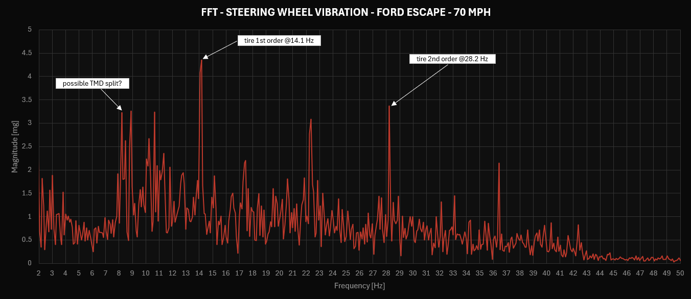
The plot is set to display from 2 to 50 Hz. Below that range you’re mostly in primary ride territory, rigid body motion of the vehicle as a whole, not the kind of localized vibration this test is built to isolate. Above 50 Hz, you’re moving past secondary ride and into a range where vibration becomes something you hear more than something you feel. The 2 to 50 Hz window is where tire and powertrain orders typically live, and it’s where this analysis stays focused.
At 70 mph, the Ford Escape’s spectrum shows seven distinct peaks: 8.2, 8.8, 10.6, 14.1, 17.3, 22.3, 28.2, and 36.4 Hz. The two dominant peaks by a clear margin are 14.1 and 28.2 Hz. A second tier (roughly similar in magnitude to each other) sits at 8.2, 8.8, and 22.3 Hz. The remaining peaks at 17.3 and 36.4 Hz are smaller still but present.
Before trusting any of this, both runs at 70 mph were compared. The same peaks showed up at the same frequencies in both, that provides confidence that what’s being measured is real vehicle behavior, not a one-off artifact of a single drive. I didn’t average the two runs; if peak frequencies shift even slightly between runs, averaging blurs them rather than sharpening the result. The cleaner of the two runs is what’s shown here.
Now the real question: what is each of these peaks actually telling you?
Identifying the orders
Two of these seven peaks have a clear, confident explanation. The rest are more interesting than that.
Tire orders — confirmed
Rather than calculating tire rotational frequency from the tire’s nominal outer diameter, I used the manufacturer-published revolutions-per-mile figure, a value based on the tire’s actual rolling behavior under load, not just its static unloaded dimensions. The distinction matters: a tire’s effective rolling radius under load is smaller than its unloaded radius, and using the empirical rev/mile figure sidesteps that gap entirely.
The math itself is simple: vehicle speed converted to the right units, divided by the tire’s circumference (derived from rev/mile), gives revolutions per minute. Convert that to revolutions per second, and you have the tire’s first order frequency in Hz. The second order is just double that.
Using that figure and the vehicle’s speed at 70 mph, the calculated tire rotational frequency lands right at the first peak that matters: 14.1 Hz. That’s the tire’s first order, one disturbance per revolution, most commonly tied to non-uniformity in the tire itself. The second tire order, two disturbances per revolution, shows up exactly where the math predicts: 28.2 Hz.
These are also the two largest peaks in the spectrum. That’s not a coincidence. At highway cruise, tire-related vibration dominates the steering wheel feel far more than anything else, which lines up with everything Post 1 explained about why tires get blamed for the things they’re actually responsible for.
As a consistency check, the same calculation was run at 60 and 80 mph. The tire first order peak shifted to exactly where the formula predicted at both speeds, confirming this isn’t a coincidence specific to 70 mph, but a relationship that holds across the speed range.
Engine orders — ruled out
At 70 mph in the highest available gear, engine speed constantly sits at around 1,980 RPM. Engine order frequencies follow the same logic in reverse: RPM divided by 60 gives the first order in Hz, and the 1.5, second, and third orders are simply that number multiplied accordingly.
Running the math for the engine’s first order, 1.5 order (relevant for a three-cylinder layout), second, and third order, and the relevant gear and final drive ratios, checked across the full 2 to 50 Hz range shown in this plot, produces frequencies that don’t land on any of the remaining peaks: 8.2, 8.8, 10.6, 17.3, 22.3, or 36.4 Hz.
That doesn’t prove the engine contributes nothing to steering wheel feel at cruise. It means the specific firing-order frequencies the engine should produce aren’t showing up at meaningful levels in this spectrum. One reasonable hypothesis: at steady highway RPM, engine mounts and the powertrain isolation system are doing real work, isolation tends to be more effective at steady cruise speed than at idle, where there’s less load and less margin to tune around. The next section puts that idea to a direct test.
The unexplained peaks
That leaves five peaks without a confirmed source: 8.2, 8.8, 10.6, 17.3, and 22.3 Hz.
The 8.2 and 8.8 Hz pair is the most interesting of the group. Two closely spaced peaks straddling roughly 8.5 Hz looks less like two independent sources and more like a single resonance that’s been split, a pattern sometimes seen when a tuned mass damper is acting near that frequency, effectively dividing one resonant peak into two smaller ones on either side. That’s a hypothesis based on the shape of the data, not a confirmed finding. It would take additional measurements, ideally with the damper isolated or removed, to actually confirm it.
The remaining peaks at 10.6, 17.3, and 22.3 Hz don’t have a working theory yet. They’re not tire orders, not engine orders, not gear orders. Suspension resonances, structural modes of the steering column or instrument panel, or something else entirely are all plausible candidates, but plausible isn’t the same as confirmed.
If you have a theory on what’s producing the 10.6, 17.3, or 22.3 Hz peaks, or want to challenge the tuned mass damper read on 8.2/8.8, leave it in the comments. This is exactly the kind of thing that benefits from more eyes on the data and the type of discussion that only gets better when there are different perspectives.
A quick look at idle: Drive vs Neutral
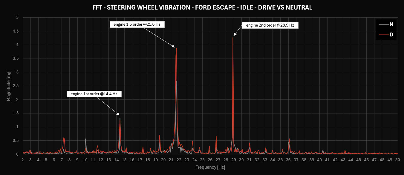
Post 2A described capturing idle measurements across six configurations. Here’s one comparison worth a closer look: Drive against Neutral, both with the AC off.
Engine RPM is essentially the same in both: around 867 RPM in Neutral, and around 870 RPM in Drive. The engine itself is doing the same work either way. The difference is the transmission. In Neutral, the torque converter isn’t transmitting engine vibration anywhere. In Drive, that same vibration has a path through the transmission and into the chassis.
The two spectra show peaks at the same three frequencies in both conditions, 14.4, 21.6, and 28.9 Hz, matching the engine’s first, 1.5, and second order at idle speed. What changes is the magnitude. The first order barely moves: 1.32 mg in Neutral versus 1.24 mg in Drive, essentially the same, if anything slightly lower. The 1.5 and second orders tell a different story: 2.67 mg in Neutral jumps to 3.88 mg in Drive, and 2.44 mg in Neutral jumps to 4.26 mg in Drive. Increases of roughly 45% and 75% respectively.
That’s not a uniform “Drive transmits more vibration than Neutral.” It’s more specific than that: engaging the transmission appears to amplify the 1.5 and second order contributions noticeably, while leaving the first order essentially untouched. Why those two orders specifically would be more sensitive to the torque converter engaging (and not the first order) is a fair question, and one without a confirmed answer here. It’s the kind of detail that’s easy to miss if you only look at overall vibration level instead of breaking it down by order.
That’s a small, controlled demonstration of something every driver has felt without naming it: shifting into gear changes what reaches the steering wheel, even when the engine itself hasn’t changed speed at all. And the way it changes isn’t as simple as “more.”
What the complete picture tells you
At 70 mph, the Ford Escape’s steering wheel vibration is a mix of confirmed tire orders, a likely structural resonance, and a handful of peaks still waiting on an explanation. None of this required a lab. It required a $484 kit, a clean signal, and the patience to match peaks to physics. And the honesty to say “I don’t know yet” about the ones that don’t fit.
This is the part that connects back to what you actually feel. The faint vibration at highway speed isn’t random, most of it is identifiable, traceable back to a physical cause, even if a few pieces of the puzzle are still open questions.
Post 3 takes this exact methodology and applies it to five different vehicles, on the same road, under the same conditions. The tire models are different. The results might surprise you.
If you’ve followed along since Post 1, this is the payoff. The vibration you’ve felt a thousand times now has a name, a frequency, and in most cases, an explanation.
Driven to Measure publishes weekly. If someone you know feels something in their car and wants to understand it, forward this to them.
Armando Guajardo is an automotive engineer specializing in NVH and tire uniformity. Driven to Measure is an independent publication. driventomeasure.com